Cards
- Bootstrap’s cards provide a flexible and extensible content container with multiple variants and options.
- A card is a flexible and extensible content container. It includes options for headers and footers, a wide variety of content, contextual background colors, and powerful display options. If you’re familiar with Bootstrap 3, cards replace our old panels, wells, and thumbnails. Similar functionality to those components is available as modifier classes for cards.
Example
Cards are built with as little markup and styles as possible but still manage to deliver a ton of control and customization. Built with flexbox, they offer easy alignment and mix well with other Bootstrap components. They have no margin by default, so use spacing utilities as needed.
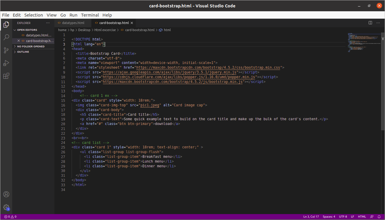
Below is an example of a basic card with mixed content and a fixed width. Cards have no fixed width to start, so they’ll naturally fill the full width of their parent element. This is easily customized with our various sizing options.


Content types
Cards support a wide variety of content, including images, text, list groups, links, and more. Below are examples of what’s supported.
Body
The building block of a card is the .card-body. Use it whenever you need a padded section within a card.

List groups
Create lists of content in a card with a flush list group.


Kitchen sink
Mix and match multiple content types to create the card you need, or throw everything in there. Shown below are image styles, blocks, text styles, and a list group—all wrapped in a fixed-width card.


- Header and footer-Add an optional header and/or footer within a card.


Comments
Post a Comment